Back a year ago or so when we saw the design that would eventually become our laneway home, we decided to get rid of our furniture (which would not have fit into it anyway) and go with a mid-century modern decorating scheme. Choosing one theme means that all your decorating goes together and you eliminate a lot of other choices when selecting furniture and accessories. No to that French provincial pouffe! Ixnay on the cottage-cute curtains! We consulted our designer, and came up with the interiors that we really wanted.
We like the calm, sleek look of the mid-century vibe, plus we know that it is a look for the ages. The last thing we want is for people to step into our place and estimate to the month exactly when we chose each piece. We want a timeless look, if you will, avoiding the pieces that were right “in style”, so our interiors would never go “out of style”.
Dated trends like overstuffed shabby-chic upholstery from the 80s, shag carpeting and the orange-and-brown colours from the 70s, the items that would immediately mark our place as “2013”.
If you know what I mean.

This room will be trapped in 1956 forEVER!
But of course, we failed. Not entirely, because some of the items we picked were chosen to evoke the 1950s — turquoise headboard and fabric in the bedroom, sputnik lamp above the bed — that are specific to that time. But we failed in the sense that some of the newest trends of 2014 (according to Style at Home) were incorporated into our decor almost by osmosis.
In the bathroom we stuck with classic glossy white subway tiles and hexagonal tiles for the shower surround. But we chose matte tiles in a neutral grey for the floor. And that is a trend for 2014, according to S@H:

As is the floating vanity, which was chosen because it’s easy to clean underneath (and it shows off our floor tiles).
In the kitchen, which is the room that you really want to get right because it’s so difficult and expensive to change it, we ended up with two features that are trends,
Built-in cabinetry that looks like furniture.
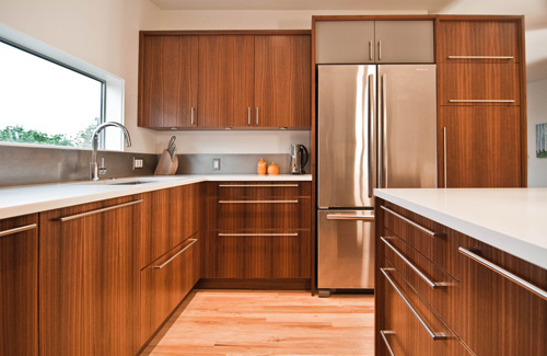
Very much like this, but with horizontal grain.
As it is described in the article
Far from the unfitted kitchens we’ve seen in the past, the new trend in kitchen design for 2014 is built-in accent cabinets that act as framework for the rest of the cabinetry. “We often design these cabinets tall and narrow to sit right on the counters, flanking the stove or on either ends of the run of cabinetry,” says Erin. “They’re usually quite contrasting in both colour and style, introducing more detail than the simple door profiles throughout.”
Because our kitchen and our sitting area are the same small space we want the cabinetry to look like built-in shelves you would find in a den or library.
Another “trend” we went with (honestly, we had no idea it was a trend) is carrying on the kitchen counters up the wall as a slab backsplash. The article recommends veined materials like marble or limestone, but in our tiny space we wanted to keep the patterns to a minimum and went with the white quartz of the peninsula and counter to be used as a backsplash behind the stove and around our little counter-height window. It looks great, the lights above catch the glints of the stone embedded in the slab, and it is a dream to keep clean.
Another trend we didn’t realize we went with was the neutral-taupey-grey colour we used throughout the space. We thought we were being as classic and timeless as we could, but according to S@H, it’s a trend.
“Trends are moving from cool to warm greys and towards beautiful taupes, explains Bev Bell, creative director for Beauti-Tone Paint.
We had to keep the paint colour neutral, we wanted a grey undertone, but we knew if we went with a bluey cool grey the rooms would look cold when the weather was gloomy and rainy. Instead, the warmth of the taupe keeps the feeling cozy.
IMHO, I think people go with decorating trends because new things become available — attractive new products that make a lot of sense at the time. Shag carpet in comfy warm oranges had never been on the market before and people liked the intimate feel it gave the room. Some people even upholstered their walls in it — remember?
And there’s a kind of zeitgeist that is reflected in our decor. Back in the 1950s, new products incorporating the plastics that had been developed during the war were available in colours people had never seen or used. And it was the “atomic age” when the A-bomb was going to guarantee our future security, as atomic power was going to fuel it. The futuristic shapes of moldable plastic influenced art and decor.

“Dreams of Eames”
So it’s not such a bad thing that we have some trends that are reflected in our decor. We can’t really avoid it, we are part of our times, we live in this era and that will inform our choices when it comes to decorating as it does our choices in wardrobes, entertainment, technology.
And our home will always reflect this time — as long as we are living in it.
